


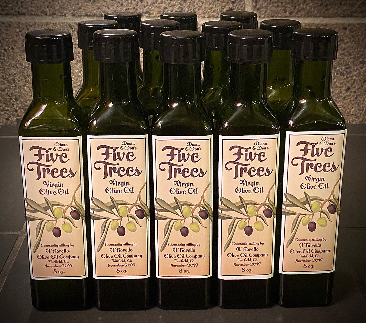
DECEMBER 2019: I designed this label and digital illustration, in Adobe Illstrator for our own “brand” of olive oil. It’s not totally ours though; it’s actually the product of a community milling event at Il Fiorello Olive Oil Co. in Fairfield, CA. Our five dwarf olive trees produced over 46 lbs of olives, which we delivered to Il Fiorello on November 24. A week later we picked up our nearly 1 gallon jug of oil, which has a much fresher and earthy flavor than your average store-bought oil.

-
December17th
Homemade Olive Oil & label design
Posted in: Projects
-
March25th
LOGO DESIGN FOR SCHOOL BOARD CAMPAIGN
Posted in: Projects
 MARCH 2016: I’m proud to be volunteering my time for my good friend Michael Minnick, who is running for SCUSD school board area 4 this year. Michael is a tireless advocate for district teachers and students, and a talented educator himself. I designed his new logo, some print materials, and am currently working on a new WordPress-based website.
Michael and his wife Rachel are big fans of Mid-Century Modern architecture and design, so we decided to incorporate that vernacular into his entire visual branding by using the classic Neutraface font and a cool teal blue and grey color scheme.
Vote Minnick 2016!
-
November27th

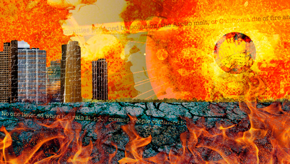
NOVEMBER 2015: I had the honor of creating a cover, three internal illustrations, and a logo that were featured in over 40 alternative weeklies and online media outlets across the country as part of the Letters to the Future climate change project.

CLICK IMAGE TO ENLARGE IN NEW WINDOW
The project was spearheaded by the Sacramento News & Review and their former editor and longtime friend Melinda Welsh. As part of the lead up to the very important U.N. Climate Conference in Paris, many award-winning authors, activists, and the general public contributed their letters to the children of the future. The letters were published online, in all of the participating print and online media outlets, and in a booklet distributed to a number of conference participants.
I was asked to design the project logos, cover illustration and three internal illustrations to be used by the newspapers, the project website (a design I also contributed to) and the project’s Facebook and Twitter pages.
CLICK IMAGE TO ENLARGE IN NEW WINDOW

CLICK IMAGE TO ENLARGE IN NEW WINDOW

CLICK IMAGE TO ENLARGE IN NEW WINDOW
-
November12th
PHOTO FEATURED IN 2016 CALENDAR
Posted in: Published
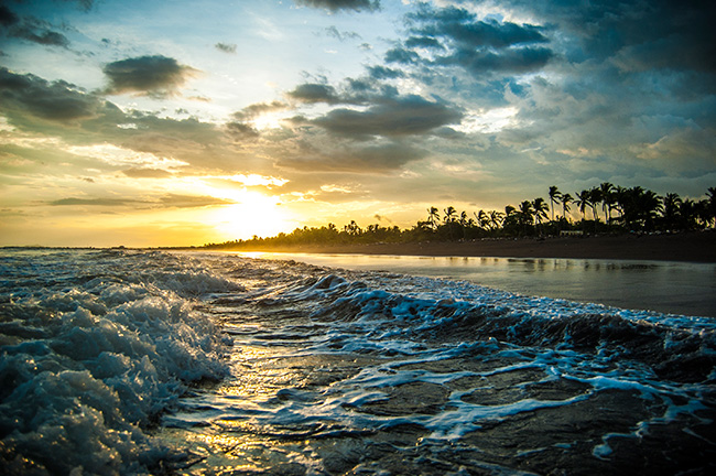
NOVEMBER 2015: Schools Credit Union choose one of my photos to be published in their 2016 member calendar. My photo, an ocean sunset in Puntarenas, Costa Rica shot this past summer, will be featured in the month of July. Only 13 photos were chosen from over 1,000 submissions.
-
May26th
THREE TIMES THE WINNER!
Posted in: Awards, Projects

THE WINNING MARKETING BROCHURE, WEB SITE AND SIGNAGE
MAY 2011: More Awards thank you very much. My graphic design work was part of the package that won three prestigious marketing awards this month. The visual marketing for Three Stages at Folsom Lake College received two first place and one second place award from the regional chapter of the International Association of Business Communicators (IABC-Sacramento).
- Brand Communication Crystal Award
- Marketing Communication Crystal Award
- Overall Communications Program Merit Award
 I spent a lot of time over the last year on the art direction and visual branding and marketing design for the region’s newest performing arts center — Three Stages at Folsom Lake College. Dave Webb of David Marketing led the team of web developer David Martin and myself and worked closely with the Executive Director David Pier. Our little 3-man team went up against stiff competition from some of the top ad agencies in town — so yeah, we’re kinda proud of this one.
And this was just for the initial kick-off in 2010. We have a ton of great stuff this year for the next go around!
-
June10th
FIRST PLACE WINNER!
Posted in: Awards, Projects
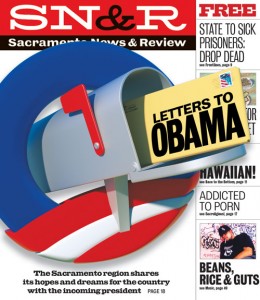
CNPA 2010 FIRST PLACE WINNER
JUNE 2010: I am proud to announce that this cover for the Sacramento News & Review won a first place for tabloid newspaper front page design from the 2010 California Newspaper Publishers Association (CNPA). I created the “Letters to Obama” logo and cover concept and worked with 3D artist Pat Crandley to turn it into a dynamic cover design. The annual CNPA awards are the largest statewide industry competition.
-
August16th
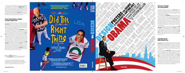
Design For Obama book cover, Taschen Publishing
AUGUST 2009: I am very, very proud to announce that my design will grace the back cover of a new book titled “Design For Obama”, published by the world’s leading art house publisher, Taschen. Co-edited by Spike Lee and featuring an essay by eminent design historian Steven Heller, the book is a chronicle of the best work submitted to Aaron Perry Zucker’s DesignForObama.org website. I will also have two other posters featured in the book, along with the designs of friends Andrew Nilsen and Chris Seddon.
You can pre-order now for the November release.
Check out all the work the DesignForObama.org
Download a the press release flyer


